Skip to content
Agorix
Updated 29 July 2026

Thank you page best practices: the most wasted page you own.

Every other page competes for attention. This one has it by default, and usually spends it on the word “thanks” and a dead end. Five ideas that earn their place here, each with the trade named out loud, plus a page-by-page reference and a skeleton you can fill in this afternoon.

05ideas, one per section
07page types covered
01next step per page

What you will have at the end

  • A confirmation that answers what just happened before it asks for anything
  • The calendar entry treated as the artifact it is, for anything with a date
  • One next step per page, sized so it can be done on a phone in a minute
  • An honest rule for when a paid offer belongs here and when it costs you trust
  • A referral ask that is made after value, not thirty seconds after an email address
  • A page-by-page reference and a copyable skeleton you can fill in today
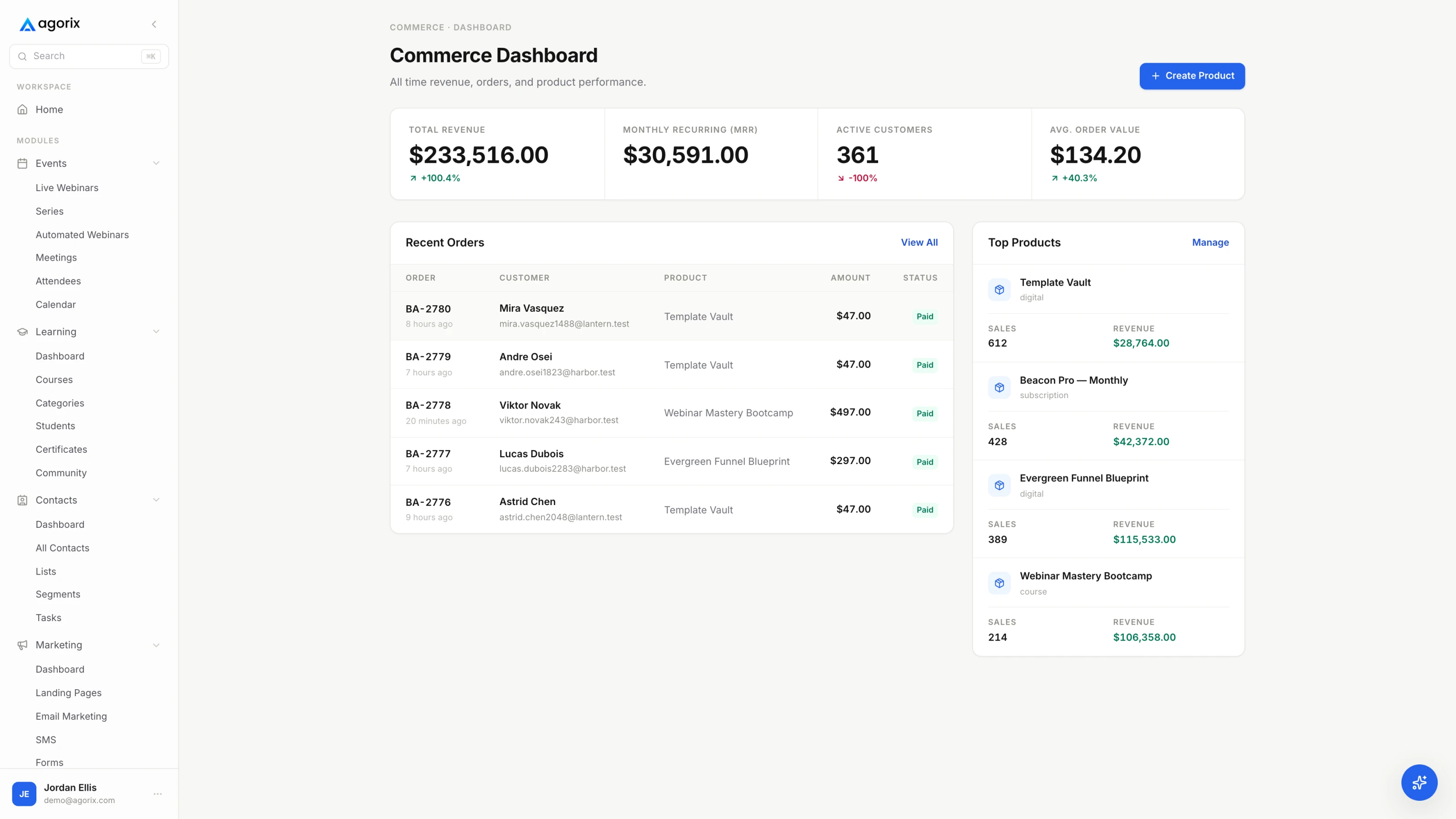
A landing page list showing each page's status, views, conversions and conversion rate.
Step 01The moment you own

The one page where you have attention without having to earn it.

Every page before this one was fighting for a click. This one arrives after the click, from somebody who has just decided in your favour and is, for about twenty seconds, completely available.

Most sites spend that moment on a sentence of thanks and a page with nothing else on it. The rest spend it on the opposite mistake: six competing links, a discount, a social follow, a survey and a video, which together produce exactly as much action as the empty version. One page has no job. The other has five, which is the same thing.

The rule the whole guide runs on

A confirmation page has one job and one optional second job. The first job is confirmation — what happened, what is arriving, what is expected of them. That is not negotiable and it comes first, at the top, in plain language. The second job is a single next step, and it is optional in the literal sense: some pages are better without one.

Everything else you might add here — an offer, a referral ask, a follow prompt — is a trade. Not a mistake, necessarily, but a trade, and the price is usually paid in trust rather than in the number you are watching. This guide names the price at the end of every section so you can decide with your eyes open.

Idea 01Confirmation clarity firstIdea 01 / 05

Answer “what did I just do” before you ask for anything.

The person on this page is briefly uncertain: did that work, what did I sign up for, what happens now. Resolving that uncertainty is the entire first job, and a page that skips it in favour of an offer reads as a bait-and-switch even when it is not.

  1. Name what they did, in their words. You are registered for [session] on [date] at [time] [timezone]. Not “success” — success is a status code, not a sentence.
  2. Say what is arriving, from whom, and where. The sender name and the subject line, so the email can be found by search rather than by scrolling. This one line prevents most of the support this page generates.
  3. Give a realistic time and a fallback. Within a few minutes; if it has not arrived by then, check the promotions tab or reply to this address. A fallback that reaches a human, not a no-reply.
  4. State what is required of them, and by when. Confirm the address, complete the profile, bring the spreadsheet, be somewhere quiet. If nothing is required, say that too — silence reads as a missing instruction.
  5. If money moved, be a receipt. What they bought, what it cost, when access starts, and how to reach support. People forward this page to the person who approves the card.

Then run the negative test. Read the page as somebody who forgot what they clicked thirty seconds ago, on a phone, in a queue, with one hand. If the facts are not in the first screen without scrolling, the page has not done its first job — and no amount of clever next-step design compensates for that.

The trade

There isn’t one. This part is not a trade.

Confirmation clarity costs you nothing except space at the top of the page, and it is the only element here with no downside. Everything after this section can be argued about. This part is simply the job, and a page that does it well buys the right to ask for the next thing.

The confirmation audit0 / 11 on the page

What just happened

What happens next

Idea 02The calendar entryIdea 02 / 05

For anything with a date, this page exists to hand over one artifact.

An email is a reminder competing with every other email. A calendar block is the schedule. If your event has a date and this page does not offer a calendar entry, the page is missing the single most useful thing it could do.

Offer it in both places — on this page and in the confirmation email — because people register on phones and keep calendars on laptops, and whichever device they are holding is the one that has to work. The treatment that makes the entry an artifact rather than a link is set out in full in how to increase webinar attendance; the short version follows.

  • The join link goes inside the entry. Not a link back to the registration page. On the day, the person opens their calendar, not their inbox, and whatever is in that block is what they will click.
  • Write the description as though it is the only thing they read. What the session is, what to bring, how long it runs, and who to contact if something breaks. Assume the emails were never opened.
  • Set an alert inside the entry. One of your reminders is now delivered by a system they already trust, on the device they already look at. It does not compete with your sending reputation.
  • Keep the entry accurate for the whole life of the event. If the time moves, move the entry. A calendar block that still says the old time is worse than no block at all, because it is the version they believe.
The trade

A calendar entry is a promise you now have to keep.

The moment somebody puts your session in their schedule, that block becomes the authoritative version of your event. Change the time by email alone and you have a room full of people arriving an hour late, holding a calendar entry that agrees with them. The upside is large enough to be worth it — but the maintenance is real, and it belongs to you rather than to them.

Idea 03The next micro-commitmentIdea 03 / 05

One next step, sized so it can be done before they put the phone down.

Somebody who just said yes is more likely to say yes again. That is the whole mechanism, and it works exactly once per page: the second ask competes with the first, and the third turns the page into a menu.

The right next step is the smallest one that moves them toward the thing they already agreed to. Not the biggest one you can get away with. If they registered for a session, the next step should make the session better or more likely to be attended — not sell them something adjacent.

  • They registered for a session. The calendar entry is the first rung and it is not optional. The second is a single question — what do you most want covered? — which gives you material for the room, a segmentation signal, and a reason for them to have thought about the session before it starts.
  • They downloaded something. The first email is already on its way, so the page does not need to sell. One question, or one three-minute video that makes the download work better. Anything larger competes with the thing they came for and usually loses to it.
  • They bought something. Lesson one, the onboarding booking, or the profile detail you genuinely need to deliver. This is the strongest moment you will get for a real commitment, because they have already made a bigger one.
  • They booked a call. The pre-call question set — what they are trying to do, what they have tried, what would make the call worth their half hour. Answers make the call shorter and better, and no-shows drop when somebody has already invested four sentences.
  • They confirmed a subscription. Tell them what arrives and when, and give them a way to set expectations: pick a topic, choose a frequency, reply with what they want. One control, not a preference centre.

Make it visually singular

One dominant element. Anything else lives below the fold as a text link, at text size, with no button. The test is a squint test: look at the page with your eyes half closed and count the things competing for the click. If the answer is more than one, the page will be less effective than the version with only the first.

Where the next step is a conversation rather than a click — a discovery call, an application, an onboarding session — the handoff from page to booking is its own piece of design; the webinar-to-call funnel covers the routing, the qualification and the pre-call questions in detail. Where it is the beginning of a sequence, the page and the welcome emails should be written together, in one sitting, so they do not repeat each other.

The trade

Every rung you add makes the one above it weaker.

A ladder is a sequence, not a page. Putting three rungs on one screen does not triple the commitment — it divides the attention you had and usually collects none of them. The version of this that works is one rung here, the next rung in the confirmation email, the third in the sequence that follows. Spread across time, the ladder is real. Stacked on one page, it is a menu.

Idea 04When an offer belongsIdea 04 / 05

An offer here is either a service or a bait-and-switch, and the difference is what came before it.

This is the idea people arrive looking for, and the one that most often gets applied without the condition attached. The condition is simple: what did the person just give you, and does the offer serve the thing they just chose?

When it belongs

After a purchase

They have already decided to buy from you. An offer that makes the purchase work better — the templates that go with the course, the faster-track option, the done-with-you version — is genuinely useful at the exact moment it is most relevant.

When it cheapens the moment

After a free trade

They gave you an email address for a thing you promised. An immediate paid ask retroactively reframes that promise as bait — and the person files it under that heading before the download has even arrived.

The test that settles most arguments: would you make this offer out loud, in person, ten seconds after somebody said yes? “Great, I’ll email that over — and if you want the workshop version, it’s here” is a sentence a decent person says. A full-screen countdown over a free checklist is not a sentence anybody says. If it sounds crass spoken, it reads worse.

Where a paid step actually belongs

Most of what people try to do on a thank-you page belongs one step earlier or one step later. An additional item offered while the card details are already on screen is an order bump, and it lives in the checkout. A second purchase completed without re-entering payment details is an upsell, and it lives immediately after the first purchase, not on a confirmation page that has to send them back through checkout again. Both are covered in order bumps and upsells, and the page they belong on is covered in checkout page optimisation.

That leaves one honest use of an offer on a free-download confirmation: the paid path you already named before they signed up. If the page they came from said this is the free version of a paid programme, mentioning the programme here is consistent rather than opportunistic. The rule is that the offer must not be a surprise.

The trade

You can convert a few of them, or keep all of their attention.

An offer on a free-download confirmation will make some money. It will also change what the download meant, for everybody who sees it, including the majority who do not buy. That is a real trade with a real price, and it is worth making deliberately for a named reason — not because a template had a slot for it. If you make it, keep it small, keep it below the confirmation, and never let it obscure the artifact they came for.

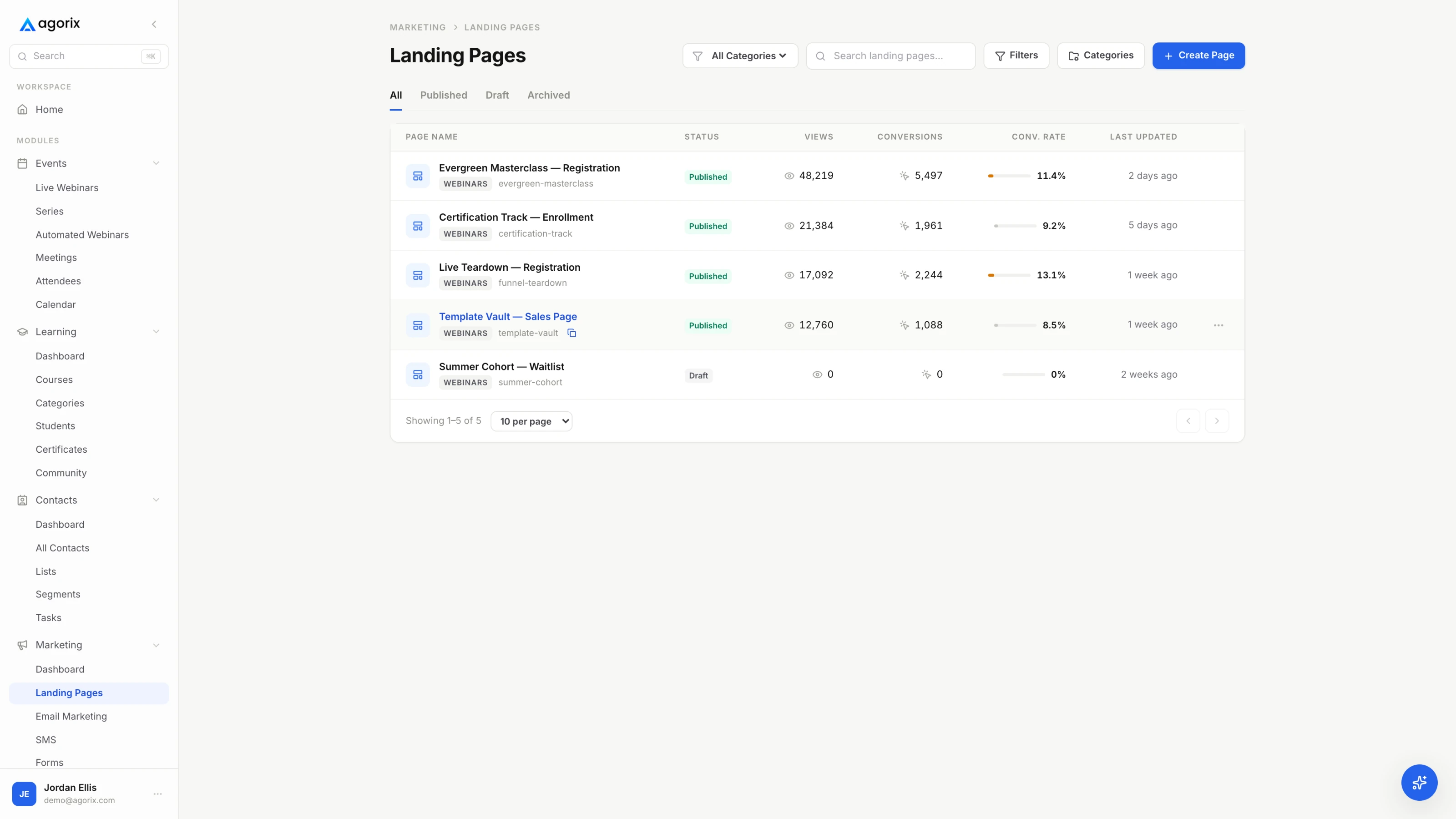
A commerce dashboard showing revenue, monthly recurring revenue, recent paid orders and the products earning them.
Fig. 02The extra offer performs best where the payment details already are — at the checkout, not on the thank-you page.
Where a tool decision changes the plan

The extra offer belongs where the card already is.

A confirmation page can carry a link. What it cannot do is take a payment without asking for the card a second time — and the second ask is where most additional offers quietly die. In Agorix, order bumps sit inside the checkout on every paid plan, and one-click upsells, where a second purchase completes on the details already given, are limited on the entry plan and included from Growth upward. Purchase, fulfilment and follow-up stay on the same customer record — see how commerce works.

Start your 14-day trial 14 days · $0 due today · Payment method required · Cancel before first charge and pay nothing
Idea 05The referral askIdea 05 / 05

Ask after you have delivered something, not after they have.

A referral is a person spending their own credibility on your behalf. Thirty seconds after an email address, they have nothing to spend it on — they have not seen the thing yet, and asking implies you think the signup was the value.

The honest sequencing is simple: value first, ask second. After they attended, after the module is finished, after the result. That ask converts better and costs nothing, because by then the person has something true to say.

The one exception, and why it works

Events. Bringing a colleague to a session genuinely makes the session better for the person invited — they get somebody to discuss it with, and the material lands against a shared problem. Here the ask is made on behalf of the person being invited rather than on behalf of your list, which is why it does not read as extraction. Give them a paste-ready sentence written for the recipient, and a link with their tag on it if you run tracking. One line, below the confirmation, no incentive required.

Asks that keep the trust

  • Ask after value has landed — they attended, finished the module, got the result
  • Ask for one specific thing: forward this to one person who has [the problem]
  • Give them a line they can paste, written for the recipient rather than for you
  • Make the invitation about the person invited, not about your growth
  • Make it easy to ignore: one sentence, below the fold, no second prompt

Asks that spend it

  • Ask for a referral before you have delivered anything at all
  • Ask for a public review in exchange for money or access
  • Pre-write a testimonial for someone who has not experienced the thing
  • Gate the artifact they already earned behind a share
  • Run a leaderboard for a free download and call it a launch

On incentives: a reward that does not distort the recommendation is defensible — a credit for both sides, an extra month, a resource they both get. A reward for a public review is not, because it buys the review rather than the referral, and readers are better at detecting that than most marketers assume. Never write a quote for somebody to approve; a testimonial you drafted is your copy wearing their name.

The trade

Every ask spends a little of the goodwill the confirmation just built.

Confirmation clarity earns credit. A referral ask spends some of it, and an early one spends more than it can possibly return. The version that costs almost nothing is a single sentence, placed after everything else, phrased so declining is invisible. The version that costs a great deal is the modal, the incentive ladder and the second reminder — all of which convert a page about them into a page about you.

ReferencePage by page type

Seven confirmations, and what each one is actually for.

The ideas above apply differently depending on what the person just did. This is the short version, arranged so you can find your page and get on with it.

The pageIts one jobThe one next stepWhat does not belong
Lead magnet downloadConfirm the file is coming, from whom, and where to look for itOne question whose answer shapes the sequence they are about to getA paid offer thirty seconds after a free trade
Webinar or event registrationRestate the date, time and timezone, and hand over the calendar entryAdd to calendar, then one short thing to bring or think aboutA second event competing with the one they just chose
Purchase receiptConfirm what was bought, what it cost, and when access startsStart step one, or book the onboarding callRe-selling the thing they have already paid for
Call bookedConfirm the slot, the timezone, and how the call actually happensThe short pre-call question that makes the call betterA pitch — the call is the pitch
Newsletter double opt-inTell them to click the confirmation link and where to find itNothing at all until they have confirmedAny second ask; the click is the ask
Application submittedSay when a human will reply, and who that human isWhat to prepare or read while they waitA meanwhile-buy-this line under an application
Waitlist joinedSay what they are waiting for and how they will be toldAsk what they most want it to includeA countdown to a date you have not committed to

Two patterns run through the whole table. The confirmation job never changes — it is always first and always in plain language. And the further from a purchase the person is, the smaller the next ask has to be: a buyer will book a call, a downloader will answer one question, and somebody who has only confirmed an email address should be asked for nothing at all until they have clicked the link.

TemplateThe skeleton

Fill in the brackets and you have a page.

The order is the point: confirmation, then the artifact, then one step, then — if it is earned — the optional line. Everything in brackets is yours to replace, and any section that does not apply comes out rather than getting filled with something.

The confirmation skeleton. One page, in the order the reader needs it. Delete the sections that do not apply instead of finding something to put in them.

Confirmation page — skeletonTemplate
[Confirmed] — [what they just did, in their words]

WHAT HAPPENS NOW
  · [The artifact: email / access link / calendar entry] arrives at
    [their address] within [minutes], from [sender name], subject
    "[subject line]".
  · If it has not arrived by [time], check [spam or promotions] or
    reply to [support address] and a human will answer.

[Events only] YOUR SEAT
  · [Session title]
  · [Day, date] at [time] [timezone]
  · [Add to calendar] — the join link is inside the entry.
  · [What to bring, or what to have ready.]

ONE THING THAT HELPS
  [The single next step, phrased as a benefit to them and doable in
  under a minute on a phone: answer [one question] / watch [three
  minutes] / book [the call] / start [step one].]

[Optional, only when it is earned]
  [One line: the offer that makes what they just chose work better,
  or the referral ask. Below the fold. Easy to ignore.]
Why this order

Uncertainty first, because an uncertain reader does not act. Logistics second, because that is what they will come back for. One step third, while the yes is still warm. Anything optional last, where declining it costs the reader nothing and costs you no goodwill.

Adapt it
  • FreeDrop the optional block entirely. Ask one question instead.
  • PaidMake the top half a receipt, and add the account and support links.
  • EventKeep the seat block. It is the most useful part of the page.
  • Opt-inDelete everything below the first block until they have confirmed.
Common questions

Six questions about the page after the form.

What should a thank you page say?

Confirmation first: what just happened, what is arriving, where it is arriving, roughly when, and what to do if it does not turn up. Then, and only then, one next step. Write it for somebody who forgot what they clicked thirty seconds ago and is reading on a phone in a queue, and make sure every fact on it matches the confirmation email exactly — the two disagreeing is the most common support ticket this page produces.

Should I put an offer on my thank you page?

After a purchase, an offer that makes the thing they just bought work better is a service rather than an intrusion. After a free download, an immediate paid ask reframes the free thing as bait, and the cost is paid in trust rather than in conversion rate. The test that settles it: would you make this offer out loud, in person, ten seconds after somebody said yes? If it sounds crass spoken, it reads worse. Where a paid step genuinely belongs is inside the purchase itself — order bumps and upsells covers that placement.

How is this different from the confirmation email?

They do different jobs and you need both. The page catches the person while they are still here, so it carries the next step. The email is the artifact they search for three days later, which is why it has to contain every fact independently — date, time, timezone, join link, receipt, access details. Neither may contradict the other, and the fastest way to guarantee they will is to write them a month apart and never read them side by side.

Should a thank you page have navigation?

For a lead magnet or a registration, keep it single-purpose. Full site navigation hands a person with no particular goal seven equally weighted things to do, and the reliable outcome is that they do none of them. After a purchase, do the opposite: give them the account link, the support address and the help centre, because they are now a customer with real questions and hiding the exits reads as evasive rather than focused.

Should I ask for a referral here?

Not thirty seconds after a free download — you have delivered nothing yet, so the ask spends credibility you have not earned. Ask once value has landed: they attended, they finished the first module, they got the result. The honest exception is an event, where bringing a colleague genuinely makes the session better for the person invited. There the ask is made on their behalf, and a paste-ready sentence does most of the work.

Does it need to be a real page rather than a message?

A real URL is worth having. It can be linked from the confirmation email, recorded as a conversion, and it can carry the calendar entry and the next step. It also survives a refresh, which an inline success message does not — and the refresh is exactly what happens when somebody hands their phone to a colleague to show them what they just signed up for.

Keep going

The pages on either side of this one.

From a confirmation to a relationship

You now have the page. Agorix is what happens after it.

Pages, forms, confirmation email, calendar entry, the live room, follow-up and checkout on one customer record — so the next step this page offers is the next step the rest of the system is already expecting.

14 days · $0 due today · Payment method required · Cancel before first charge and pay nothing