Reads three headings and the price
The page has to work as a set of headings, a summary of what is included, the price and the terms. If skimming it produces a wrong impression, the page fails for most of its audience.

The distinction is not length, and arguing about word counts is how teams avoid the actual question. There are three jobs — capture, convince, transact — and a page is named after the one it does. This guide decides which page you need, how long it has to be and why, and how the pages hand off without leaking.
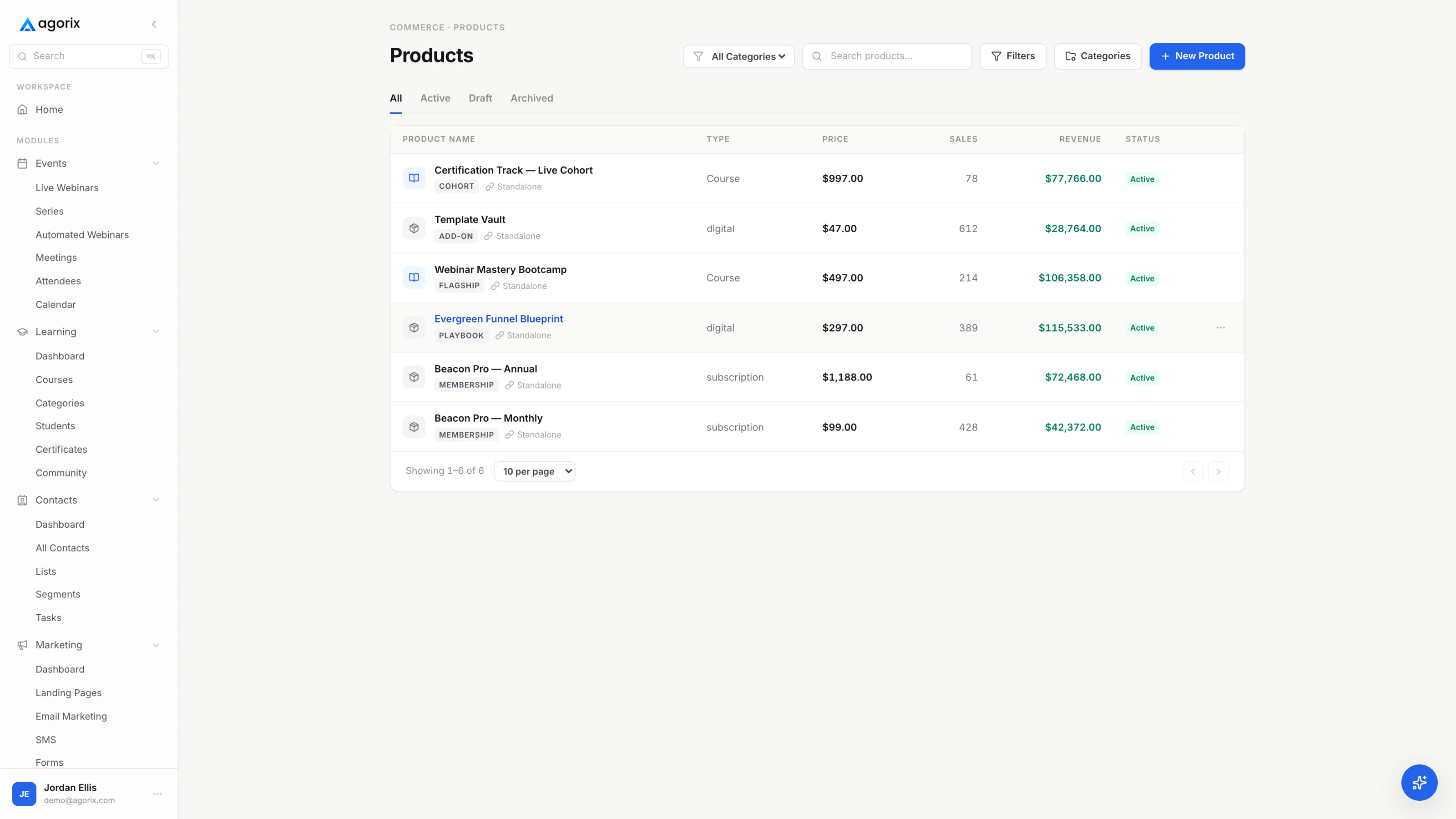
Almost every argument about sales pages against landing pages is really an argument about length, conducted by two people who have not agreed what either page is supposed to accomplish. Agree that first and the length question mostly answers itself.
The confusion is genuine and worth naming. “Landing page” is used two ways in the wild: loosely, for any page traffic lands on — which would include a sales page — and specifically, for a page built to capture. A sales page is, technically, a page people land on. Throughout this guide the narrow definitions are used, because they are the ones that help you decide something: landing page means capture, sales page means convince, checkout means transact.
The practical consequence of mixing them is predictable. The amount of argument required to convince a stranger is exactly the amount of distraction that kills a capture form, and the single-minded stripping-back that makes a capture page work leaves a sales page with unanswered questions and no way to ask them. A page that attempts both usually does neither, and the report will read as though the copy is weak when the problem is that the page has two jobs.
A landing page is short not because short converts better, but because the trade it proposes is small. You are not asking anybody to accept a worldview. You are asking them to believe that an email address is a fair price for a specific, immediate thing.
That is the whole page, and the discipline is subtraction. Every additional element — the navigation bar, the footer links, the second offer, the social icons — is a route out of the decision. What each of these sections is doing, and the order that works, is covered in detail in the landing page anatomy guide, and how to write them is in landing page copywriting.
When the ask stops being small. An application that takes twenty minutes, a call that costs somebody an hour, a paid event, a trial that requires payment details — these are captures with real costs attached, and a page that pretends otherwise collects the wrong people. Here the page starts doing some convincing: who this is for, what happens on the call, what it will not be. It is still a capture page. It is just an honest one about the size of what it is asking.
That sentence is the whole specification, and it explains the length without appealing to any statistic. Unanswered questions are what stop a purchase. Each answer takes words. The page is finished when the questions are answered, not when it reaches a number.
Two of those deserve emphasis because they are the ones most often left out. The disqualifying line — who this is not for — is worth more than any amount of enthusiasm, because it is the only sentence on the page that could cost you a sale, and readers know it. And the terms: the refund policy and any guarantee belong on the page next to the price, in plain words, not behind a footer link that the reader has to go and find in order to feel safe.
The price itself is part of the argument rather than an afterthought at the bottom. What it is, what it replaces, and what it costs to keep doing nothing — that is the comparison the reader is actually making; pricing digital products covers how to arrive at the number, and this page is where you have to defend it.
A template pack at a low price, sold to people who already know what it is, needs a description, a screenshot, a price and a button. A substantial programme bought by somebody who met you this week usually needs everything in the list above. Same principle, opposite outputs — which is exactly why the length question cannot be answered without naming the reader.
Two variables decide this, and neither of them is your preference. How well does this visitor know you, and how much are you asking for? Find your row.
| Traffic and ask | The page that fits | Why that one |
|---|---|---|
| Cold — ads, search, a stranger’s audience Small: an email address for something specific | Landing page | A stranger will trade an address for a clear, immediate thing. They will not read an argument from somebody they met four seconds ago. |
| Cold Large: a paid product | Landing page first, then convince over time | Selling something substantial to a stranger on one page is the hardest version of this job. Capture first, then earn the argument by email, a session, or a call. |
| Warm — your list, past attendees, your community Small | Landing page, very short | They already know who you are, so most of the page is redundant. A sentence, the specifics and the form. |
| Warm Mid: something they can evaluate quickly | Sales page, moderate | The open questions are about the offer rather than about you. Answer those, skip the credibility section they do not need. |
| Warm Large: high-ticket, cohort, coaching | Sales page that books a conversation | The page qualifies and books; the conversation closes. Asking a page to carry a decision this size usually produces silence rather than a no. |
| Hot — just watched you teach, came from a call Any | Short sales page, or straight to checkout | They have already decided. Re-arguing the offer reopens a question they had closed, which is the most expensive kind of thoroughness. |
| Any temperature, an event Attendance: an hour of their time | Registration page | A landing page with a date, a timezone, a replay policy and a room that has a ceiling. Different constraints, same job. |
The pattern underneath the table: the colder the traffic and the larger the ask, the more steps you need between arrival and money. Cold plus large is the hardest cell in the grid and the one most people try to solve with a better page, when the actual solution is another step — a session, a sequence, a conversation — that lets the argument happen over days instead of in one scroll.
Temperature is a property of the traffic, not of the page, which has an awkward implication: the same page can be too long for one source and too short for another. If a single offer is sold to both your list and to strangers, that is the honest argument for two versions of the page pointed at different sources. The trade is two pages to maintain and two places for the price to go out of date — which is a real cost, and the reason most people should not do it until the volume justifies it.
“Long copy converts better” and “nobody reads any more” are both folklore, and both are quoted with equal confidence by people selling different things to different audiences. Neither is a rule you can apply to your page, because length is not a lever. It is a consequence.
Write down every question a real buyer asks before deciding — from your inbox, from calls, from the replies to your last send. Answer each one exactly once, in the place the question naturally arises. Then delete every paragraph that answers nothing on the list. What remains is the right length for that page, that offer and that audience, and it will be different from the right length for somebody else’s.
Order matters more than length. A long page that answers the price question in the correct place reads as shorter than a brief one that withholds it, because withheld information makes a reader stop and scan rather than continue. If people are scrolling straight to the bottom, the page is not too long — the thing they are hunting for is in the wrong place.
The page has to work as a set of headings, a summary of what is included, the price and the terms. If skimming it produces a wrong impression, the page fails for most of its audience.
Usually the one about to spend the most. They are looking for the part where you admit something. Give them the disqualifying line, the terms and the detail, and they buy.
Both readers are on the same page and you cannot know which is which. That, rather than any conversion statistic, is the real argument for a long page with a strong skimming layer: headings that carry the meaning, a summary box, the price stated plainly, and the depth available underneath for anybody who wants it.
Each page in a funnel makes a promise and passes the visitor to the next one. Almost every unexplained drop happens at a handoff, where the vocabulary changes and the visitor quietly concludes they are in the wrong place.
One rule covers all six: the next page repeats the promise the last one made, in the same words. Not a synonym, not an improved version — the same words. An ad that says “teardown”, a page that says “masterclass” and a checkout that says “course access” describe one product to you and three to a stranger, and the stranger is the one deciding.
The second rule is that each page stops where its job stops. The landing page does not sell the product. The confirmation page confirms and offers one next step rather than starting a second pitch. The sales page does not collect payment details. The checkout does not re-argue the offer. Overlapping jobs is how a funnel ends up making its case twice to half the people and never to the other half.
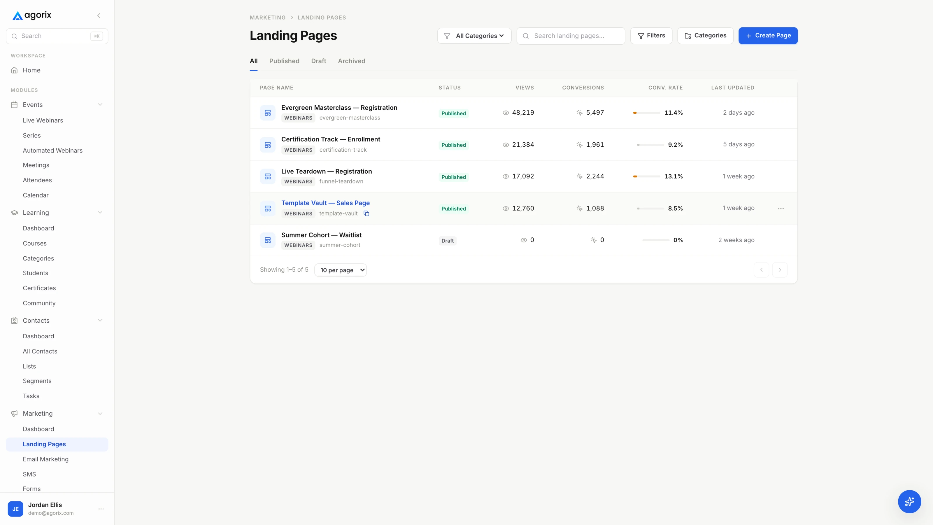
When the sequence underperforms, resist the urge to rewrite the page you like least. Find the stage that is failing first — funnel diagnostics works through that in order — because a perfect sales page cannot rescue a capture page collecting the wrong people, and no amount of capture fixes an offer nobody wants.
Building the pages is the easy part. Knowing that the person who read the sales page is the same person who registered three weeks ago and bought yesterday is the part that normally requires reconciling exports. Landing pages, registration pages, forms, checkout and order bumps are included on every paid Agorix plan, and they write to one customer record — see how marketing works.
An event registration page is a landing page in every structural sense: one ask, one form, a small trade. What makes it a specialised case is that it is selling a moment in time rather than a file, and time has properties a PDF does not.
That third point is worth sitting with, because it inverts a habit. On most pages, more conversions is unambiguously better. On a registration page for a live session, conversion has a capacity attached to it, and the promotion plan and the room size are the same decision made twice. The full anatomy — the title, the outcome bullets, the minimal form, countdown honesty — is in the registration page guide, and where it sits in the wider sequence is in the webinar funnel.
None of these failures look like failures from the inside. They look like good pages with disappointing numbers, which is why they survive so long and get rewritten so often.
One verb, no conjunctions. Submitted the form. Clicked into checkout. Completed the payment. Booked the call. If the answer needs an “and”, the page has two jobs and it will do both worse than a page with one. This single question catches every failure above before it gets built, and it is faster than any audit.
One closing point about the argument this guide opened with. When somebody asks whether they need a sales page or a landing page, they are usually asking permission to write less. The honest answer is that the length was never the question: name the job, name the reader, list their questions, and the page writes itself to whatever length it needs to be.
The job, not the length. A landing page captures a small commitment — an email address, a registration, an application — and succeeds when a form is completed. A sales page convinces somebody to spend money or real time, and succeeds when a person who now understands the trade clicks into a checkout, which is a third page with a third job: take the payment without losing them. Length follows the job. It does not define it.
Yes, when the ask is large enough to need convincing — an application, a paid event, a call that costs somebody an hour of their day. The page then carries some argument, and it grows. The failure is the reverse: adding argument to a page whose ask is tiny. A nine-section case for a newsletter subscription signals that the trade must be worse than it looks, and the extra copy competes with the only thing on the page that matters.
As long as it takes to answer every question a buyer asks before deciding, and no longer. Length is a function of how many questions the reader has, how much the ask costs them, and how much they already trust you — which is why the same offer needs a longer page for cold traffic than for people who watched you teach for an hour last Tuesday. Word counts quoted as rules are folklore in both directions. List the real questions, answer each once, cut everything that answers nothing, and if you want to know whether the shorter version wins, that is a real test — read the traffic check first.
If you sell something substantial to people who do not know you yet, usually yes: the landing page captures the address, the sequence or the session does the convincing, and the sales page is where the decision gets made. If you sell a small, easily evaluated product to people who already trust you, one page can do both jobs perfectly well. Build the second page at the point where you can name what it does that the first one cannot.
Yes — a specialised one. Same capture job, three extra constraints: the date and time have to be correct in the visitor’s timezone, the replay policy has to be stated honestly because it changes who shows up, and the room has a capacity ceiling. That last one makes an event page the only kind of landing page where succeeding beyond your plan costs money. The registration page guide covers the anatomy in full.
A capture-focused landing page should not: every extra link is a way to leave without deciding, and there is nothing on the page a visitor needs that is not on the page. A sales page for a considered purchase is different, because the questions have to go somewhere. Detailed terms, an FAQ, a contact address and the refund policy reduce anxiety more than they leak traffic. Removing every exit from a page asking for real money reads as pressure, and readers are good at noticing it.
Landing pages, registration pages, forms, email, the live room and checkout on one customer record — so the handoffs between them are configuration rather than integration work, and the report tells you which seam is leaking.
14 days · $0 due today · Payment method required · Cancel before first charge and pay nothing