Measure the page you have
Conversion rate by source, and the share of readers who reach the ask at all. Without those two numbers, a redesign is a change of opinion rather than a change of outcome.

A landing page is one argument in three moves — a promise, proof the reader can check, and a single ask. This guide reads a page from the first screen to the confirmation, naming what each zone is for, what belongs in it, what to take out, and the mistakes that quietly cost conversions. Written to work with any page builder; where a tool decision genuinely changes the plan, it says so.
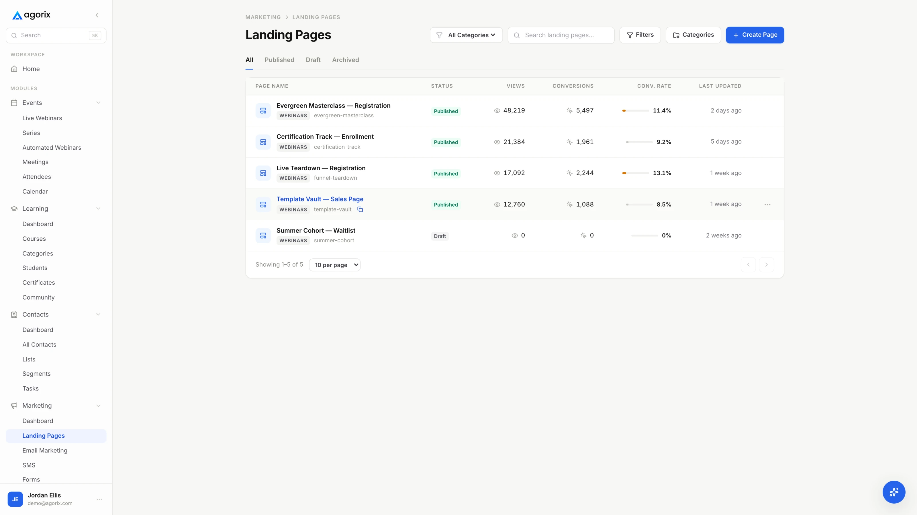
A landing page is not a brochure with a button attached. It makes a promise, supports that promise with something the reader can check, and asks for one thing. Every element on the page is doing one of those three jobs — or it is standing in front of something that is.
That is the whole test, and it is more useful than any layout. Point at any block on a page you already have and ask which of the three moves it belongs to. The blocks that cannot answer are the ones costing you conversions, and they are almost always there because somebody had them lying around: the company history, the second offer, the awards row, the newsletter box that competes with the actual ask.
Before you open a builder, finish this sentence: this page exists to get [a specific person] to [one action]. One person, one action. A page that asks for a download and a call and a newsletter subscription has not offered three chances to convert; it has asked the reader to make a decision about which decision to make, which is a slower and less pleasant thing to be asked.
The one-job sentence also decides the kind of page you are building. A page collecting an email address for something free is a different object from a page selling a two-thousand-dollar program, and the difference is not decoration — it is how much argument the page has to carry. Sales page or landing page works through which page suits which job.
The eight zones below are where those three moves land on a real page. A short page runs all three in one screen; a long page spends six screens on proof and objection handling. The order does not change, and neither does the rule that every zone has exactly one job.
The first screen is not a decoration on top of the page. It is the whole page for anybody who does not scroll, and it is the reason most of them do not.
A reader arriving from an ad, an email or a post is carrying a half-formed expectation and about as much patience as it takes to read two lines. The first screen either confirms the expectation or contradicts it. If it confirms it, they keep going and every other zone gets a chance. If it contradicts it — different words, different offer, a heading about your company rather than their problem — they leave, and no amount of excellent argument further down the page is ever read.
Whatever sentence sent them — the subject line, the ad headline, the link text — the first screen should continue it, ideally in the same words. This costs nothing and is skipped constantly, usually because the page was built before the campaign and never revisited afterwards. If you run one page behind several different sources, match the biggest source and accept the rest, or build a variant for each of the ones large enough to deserve it.
There is no fixed line. What matters is the first screen on the device a real reader is holding, which is usually a phone in portrait with a browser bar eating the top. Check it there first. A hero that looks commanding on a desktop monitor frequently pushes the button, the date and the entire promise below the visible area on a phone — and phones are where most of your readers will decide.
The mistake that costs the most here is the company-shaped headline: a line that would be equally true on a competitor’s page. “Enterprise-grade solutions for modern teams” names no problem, no outcome and no person. Replace it with the sentence the reader would use to describe what they are trying to do, and the rest of the page gets easier to write.
The promise block is where a reader decides whether the trade is worth making. It has three parts, and pages usually ship with one of them missing.
Three to five bullets do the work here, and each one should point at something the reader will be able to do — not at something the product contains. The test is to add “so you can…” to the end of the bullet. If nothing sensible follows, you have written a feature and labelled it a benefit. The wording of those bullets is the single highest-leverage paragraph on most pages, which is why it has a guide of its own.
Every intensifier on a landing page is a signal that the claim underneath it is weak. “Dramatically improve your onboarding” is weaker than “cut the first-week questions you answer by hand”, because the second one names something the reader recognises from their own week. If you find yourself reaching for an adverb, you are usually missing a noun.
One more thing belongs here and is almost always missing: what the reader has to do. An offer that requires attending live, or reading something before the first call, or having an existing audience, should say so in the promise rather than in the terms. People who find out later feel misled, and they are right.
Proof is not a testimonial section. Proof is anything that makes the promise plausible to somebody who has no reason to believe you yet — and most businesses have more of it than they think.
This zone is where new pages go wrong in the most expensive way, because the shortcut is so available. A page with no customers can be given five testimonials in ten minutes. Nobody will check them. It still should not be done, and not only for the obvious reasons: invented proof sets an expectation the delivery cannot meet, it attracts the wrong buyers, and it is the one mistake on this page that a redesign cannot undo once somebody notices.
A wall of testimonials above the promise is a set of answers to a question the reader has not asked yet. Put each piece of proof next to the claim it supports: the credential near the promise, the sample near the description of the work, the refund policy near the ask. Proof placed against the right claim does several times the work of the same proof gathered into a carousel.
The most persuasive thing a page with no track record can do is be unmistakably competent. Give away a real piece of the method on the page itself — the actual framework, the actual first step — and let the reader draw the conclusion. Demonstrated ability is the one form of proof you can manufacture honestly, because manufacturing it means doing the work.
The body is the distance between “this sounds good” and “I believe this will work for me”. Its length is decided by price and unfamiliarity, not by taste.
A free download for people who already know you needs almost no body at all. A two-thousand-dollar program for strangers needs a long one. The common advice that “long pages convert better” and the opposite advice that “nobody reads any more” are both wrong in the same way: length is not the variable. Unanswered objections are. Write until the real objections are answered, then stop.
| What they are thinking | What actually answers it |
|---|---|
| Is this for me? | The headline and the qualifier line beneath it. If a reader has to reach the third paragraph to work out whether they are the intended audience, most of them will not reach it. |
| What is it, exactly? | The format, the length and the delivery, stated plainly: a forty-page workbook, a sixty-minute live session, a six-week cohort starting on a named date. Vagueness here reads as evasion even when it is only laziness. |
| How does it work? | Three steps, in order, where the first one is something the reader does rather than something you do. A mechanism the reader can picture is worth more than another adjective about the outcome. |
| What does it cost me? | Money and time, both. A free thing still costs an email address and an hour of attention — say so, because the reader is doing that arithmetic whether or not the page helps them. |
| What if it does not work? | Terms, refund policy, what happens if they cannot make the date. The answer to a risk question is a policy, not a reassurance. |
| Why now? | A real reason: the date, the cohort, a price change you will actually make. If there is not one, do not manufacture one — a deadline you do not hold teaches people that none of your deadlines are real. |
Where do the real objections come from? Not from imagination. They come from replies to your emails, questions in sales calls, support tickets, and the things people type in chat during a live session. A body section written from that material answers questions readers actually have, in the words they actually use, which is also why it tends to read better than a body written from a template.
The ask is where the page stops arguing and starts asking. Two rules carry it: repeat the same ask, never multiply it, and say what happens immediately after the click.
Repetition is not duplication. On a long page the same ask should appear several times — after the promise, after the proof, after the objections, at the end — because a reader who becomes convinced at screen four should not have to hunt for the button. Multiplication is different: a page offering a download, a demo booking and a newsletter subscription has three asks and converts on none of them particularly well, because it has handed the reader an extra decision before the one that matters.
Most hesitation at the button is not doubt about the offer. It is uncertainty about the next five seconds: does this charge me now, does it call me, does it start a subscription, how do I get out. Answer it in one line under the button. The trial line under our own buttons is written exactly that way — the length, that nothing is due today, that a payment method is required, and that cancelling before the first charge costs nothing — because every one of those clauses is a question somebody would otherwise have to guess at.
“Submit” describes what the form does. “Get the checklist” describes what the reader gets, which is the only part they care about. Match the button to the heading directly above it, so that reading the two together makes one sentence rather than two fragments. Button copy patterns are in the copywriting guide, along with the microcopy that sits underneath.
On pages where the ask is a purchase rather than a form, the same rules carry through to the checkout itself — and the checkout is where a surprising share of convinced readers still stop. Checkout page optimization picks the page up from there.
Somebody who reaches the bottom of a page without clicking is not uninterested. They are unresolved. This zone exists for them, and it is treated as a dumping ground on most pages.
The reader who scrolls past your ask is doing one of two things: looking for the answer to a specific worry, or looking for a reason to trust you. Both are addressable. What they will not do is scroll back up through the argument they have already read — so the bottom of the page has to carry both the remaining answers and another way to act.
Not because readers love reading questions, but because it is the one block where they can find their own worry without reading anyone else’s. Use it for genuine objections, in the reader’s words, answered without defensiveness. An FAQ full of questions nobody asked — “why is your solution the best?” — is marketing copy in a costume, and readers spot it immediately.
One structural note: the page should end with something to do. A page whose final element is a link farm has spent its last impression telling the reader to go somewhere else. End with the ask, and put the legal links underneath it in the type size the law requires rather than the type size that invites clicking.
Every field is a tax paid in completions. The test for keeping one is simple: name the workflow that reads it. If you cannot name a workflow, the field is collecting data for a report nobody opens.
Run that test out loud, field by field, on a form you already have. “Company” — who reads it? “Phone” — what happens when it is filled in? A field that survives the question earns its friction. Most do not, and the ones that do not are usually there because somebody thought the data might be useful one day.
| Field | What it costs | When it earns its place |
|---|---|---|
| Email address | Nothing. It is the point of the form. | Always. Every other field on this list is optional by comparison, and should be argued for against this one. |
| First name | Very little, and it buys a usable greeting. | When the follow-up is written to a person rather than to a list. Ask for the first name alone — “full name” is a longer field that you will only split apart later. |
| Company | A visible pause while somebody decides how to describe themselves. | On pages selling to organizations, where the answer routes the enquiry or changes who replies. Not on a page offering a download. |
| Phone number | The largest single drop on most forms, because it implies a call. | When a call is genuinely the next step and the page has already said so. Never as an optional afterthought — an optional phone field costs you completions from people who assume it is required. |
| Role, team size, budget | A qualifying question, which is a filter rather than a field. | On application-style pages where you intend to disqualify people, and where saying that plainly improves the fit of everyone who continues. |
| How did you hear about us | Cheap for the reader, unreliable as data. | Rarely. Tagged links answer the same question without asking, and they answer it accurately — a reader guessing at attribution is not a source report. |
| Your biggest challenge (free text) | The most expensive field on any form: it asks for thinking. | When you will read every answer and it changes what you send. An excellent research field on a small volume, and a poor default on a page you expect to scale. |
Splitting a form across steps helps when the first step is trivially answerable, because starting is easier than finishing and people who start tend to continue. It does not help when the offer is unwanted — a form nobody wants to complete is not improved by being served in instalments. Treat multi-step as a remedy for length, not as a remedy for a weak promise.
Any builder will render these zones. The part that decides whether the page is worth anything is what happens to the submission — whether the follow-up knows which page someone converted on, and whether the purchase three weeks later is still attached to it. In Agorix, pages, forms, email and the customer record are one system — see how marketing works.
The page is not finished at the submit button. The zone after it is the one people build last, build worst, and then wonder why a converted reader never engaged again.
Three things have to happen in the first minute. The thing you promised has to arrive. The reader has to be told what happens next, from whom, and when. And the conversion has to be recorded against whatever produced it, because the source that brought this person is the only way you will ever know which of your channels is working.
The confirmation page deserves more thought than “Thanks, check your email”. It is a page with a captive, positively-disposed reader and no competing demands — thank-you page ideas covers what to put on it and in what order. If your one extra ask is a paid one, the mechanics are in order bumps and upsells.
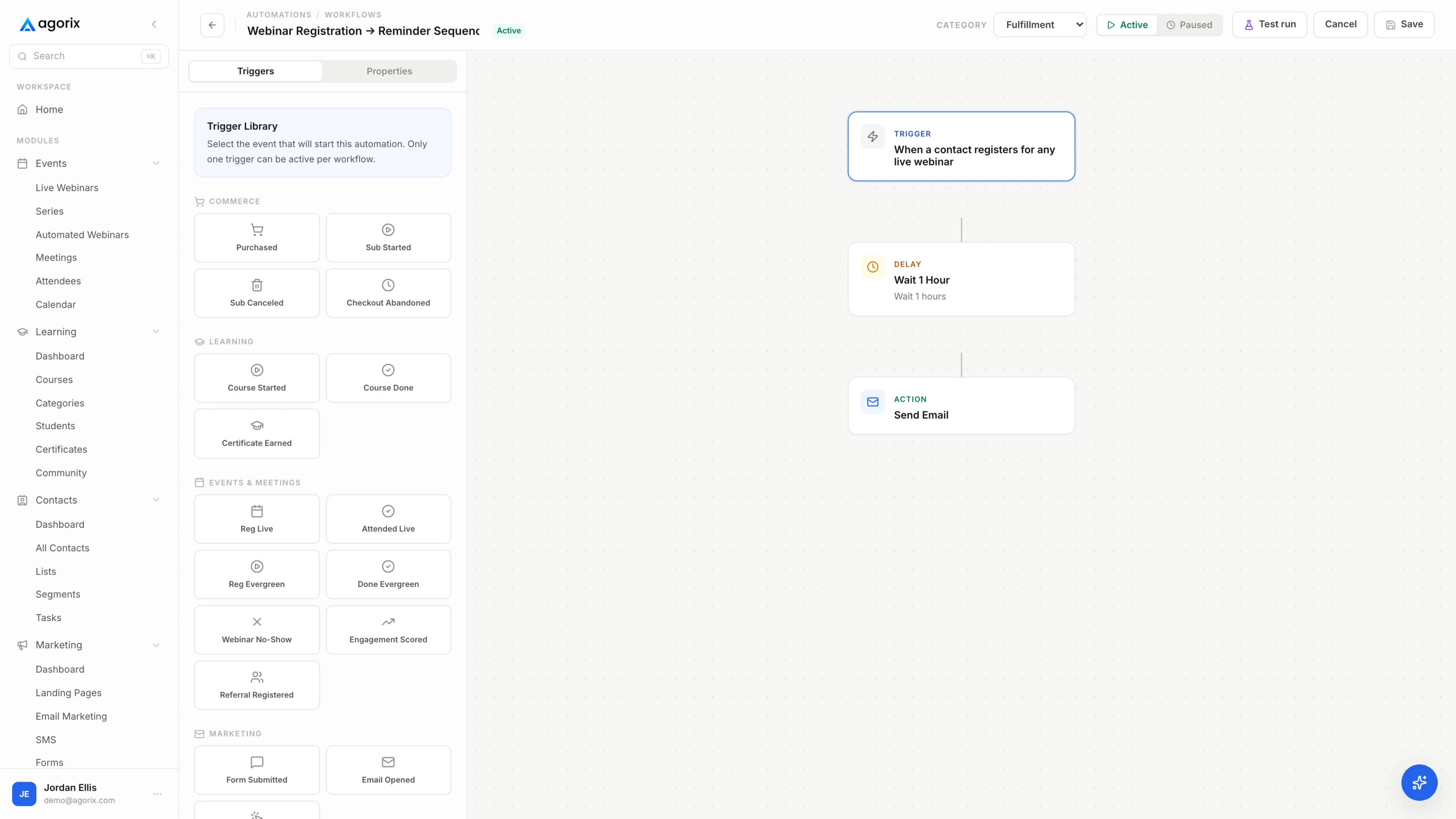
Whatever the first email says, it has to arrive. Email deliverability basics covers the sending setup that decides whether it does, and the welcome sequence covers what the next few days should contain. For a registration page, the follow-up window afterwards is its own playbook — what the registrations are worth is decided there rather than on the page.
Twenty checks, four zones of the page, about ten minutes. Run it on the page as a stranger would meet it: on a phone, on an ordinary connection, without being logged in.
The order matters. Fix the first screen before anything else, because a reader who leaves in the first few seconds never saw the work you did further down. Then fix the ask, then the form, then the middle. It is the reverse of the order most people work in, and it is the order the returns arrive in.
Conversion rate by source, and the share of readers who reach the ask at all. Without those two numbers, a redesign is a change of opinion rather than a change of outcome.
Change the headline or the form or the offer, not all three. At small volumes the honest answer is often “not enough data yet”, and acting as though it were a result is how pages get worse over time.
A promise, proof and an ask. In practice that becomes the eight zones above: a first screen that says what this is and who it is for, a promise block naming the outcome and the format, proof the reader can check, a body that answers objections in the order they arrive, one ask, a below-the-ask section for the people still deciding, a form asking for the least you can defend, and a confirmation step that delivers and sets the next expectation. If an element on your page is not doing one of those jobs, it is competing with the one that is.
Length is decided by price and unfamiliarity, not by taste. A free download for an audience that already knows you needs a short page. An expensive program for people meeting you for the first time needs a long one. Long pages are not more persuasive than short ones — unanswered objections are less persuasive than answered ones. Write until the objections are answered, then stop.
No. Site navigation is a list of alternatives to the one action the page exists for. Remove the header menu and the footer link farm, and keep only what you are obliged to keep: privacy, terms and a contact route. The exception is a considered purchase where people genuinely need to research you — and even then the better answer is usually to bring that material onto the page. Sales page or landing page covers where that line sits.
As many as you can defend one at a time. For each field, name the workflow that reads it; if you cannot name one, delete the field. Email alone is usually enough for a download or a registration, and first name earns its place when the follow-up is written to a person. Qualifying fields belong on application pages where you intend to disqualify people. Every other field is a tax paid in completions for data you may never open.
Proof you actually have — and never proof you invent. The work itself is proof: a sample, a preview, the first module, a screenshot of the real thing. Demonstrated expertise is proof: the specific detail an amateur would not know. So are plainly stated credentials, a named refund policy and honesty about what is not included. Fabricated testimonials, borrowed logos and invented counts are not a shortcut — they are the one mistake on this page that a redesign cannot undo.
Split conversion rate by source before you rewrite anything. If one source converts and another does not, the page is probably fine and the mismatch is between the promise and who is arriving. If every source converts badly, the problem is on the page, and the first screen is where to look — a reader who leaves in the first few seconds never saw the rest of it. Then change one thing at a time, the way simple A/B testing describes, so you can tell what moved.
Landing pages, registration pages, forms, email campaigns and the customer record are included on every paid plan and sit together — so the page somebody converted on is still attached to them when the follow-up goes out, and when they buy.
14 days · $0 due today · Payment method required · Cancel before first charge and pay nothing