Turn on, resize, translate
A separate file delivered with the video. Students switch it on when they need it, the player controls the size, and it can be swapped or translated without touching the lesson.
Six areas, ordered by how much they cover for the effort they cost, plus a 12-check pass to run before a lesson goes live. Written for somebody publishing their own course with no budget for a specialist — and honest about the point where the question stops being craft and becomes one for a professional.
Accessibility gets filed as a compliance chore aimed at a small group. In a course it behaves more like ordinary quality work: the same changes that make a lesson usable with a screen reader make it usable on a train, in an open-plan office, in a second language, and at 1.5 speed.
Start with who it is for, because the list is longer than the obvious answer. Students who are deaf or hard of hearing. Students with low vision, or who cannot separate the two colours you used to distinguish two things. Students who cannot use a mouse comfortably. Students who need structure to hold attention, or who are working through the course in a language they learned second.
Then everybody else, most of the time. The person watching without sound because the baby is asleep. The person in an open-plan office with no headphones. The person on a train where the audio keeps dropping. The person who reads faster than you talk and would rather skim the transcript. The person coming back three weeks later trying to find the one sentence about the thing. Captions and transcripts serve all of them, which is why they are the first two areas here.
The reason to do this while you build rather than later is arithmetic. Per lesson it is minutes: correct a caption file, save a transcript, write four pieces of alt text. Across a finished course it is a project with a scoping meeting. The work is identical; only the framing and the likelihood of it happening change.
Nothing in the right-hand column is wrong. An audio-description track is genuinely valuable, and a professional review is the only way to know where you stand formally. They are simply not where somebody with one free afternoon and twelve published lessons should start.
Automatic captioning has become genuinely good at ordinary speech and is still unreliable at precisely the words a course depends on. That combination is what makes an uncorrected caption file feel finished and read as careless.
The correction pass is one read of the caption file against the audio, at speed, fixing those four categories and leaving the rest. Build a term list on the first lesson — your names, product names, acronyms and the spellings you prefer — and reuse it for every lesson afterwards. Where your captioning tool accepts a vocabulary or glossary up front, put the same list in there and the correction gets shorter still.
A separate file delivered with the video. Students switch it on when they need it, the player controls the size, and it can be swapped or translated without touching the lesson.
Text baked into the picture. It cannot be turned off, cannot be resized, and sits on top of the interface you are demonstrating. Useful for a short clip; a poor default for a course.
One more thing worth saying out loud: if part of your course is live, say at the top of the session whether captions are running and what will exist afterwards. Live automatic captions are a convenience with the same failure modes as above, so the corrected version belongs on the recording rather than in the room.
Captions serve somebody watching. A transcript is a document — and a document is searchable, skimmable, quotable, translatable and readable by somebody who would simply rather read than watch.
For students it is the feature that makes a course usable a second time. Nobody rewatches six lessons to find the sentence about pricing tiers; they search for the word “tier”. A transcript turns your video course into something with a find function, which is most of what people mean when they say a course is well organised.
For you it is source material. The corrected transcript is the lesson notes, the summary, the outline of a written version, the quotes for the sales page, and the answer to “which lesson covers this?” when a student asks. It is also the only text a machine can read: on a public page — a free lesson, a sample, an article built from a lesson — a transcript is text where there was none before. That is worth having, and it is not a ranking strategy on its own. A transcript locked inside a paid course is an asset for students, not for search.
Format it lightly before you publish it. Cut the timestamps if the player does not need them, break it into paragraphs, add the lesson title as a heading and label speakers where there is more than one. A verbatim dump with no line breaks technically contains the same words and is not something anybody will read twice. Ten minutes of formatting converts a compliance artefact into a study aid.
Slides and screen recordings are where legibility is won or lost. Both are decided before the record button, and neither can be repaired later without recording again.
Pick one pair of colours for body text and check it rather than judging it on the monitor you chose it on. WCAG asks for a contrast ratio of at least 4.5:1 for normal text and 3:1 for large text; free checkers will score a pair in seconds. Grey text on a white slide, thin light type on a photograph, and the brand colour that looked fine in the deck are the three that fail most often.
A slide is not a document. Six lines of large type beats twenty lines of small type in every respect, including how much of it the student remembers. For screen recordings, scale the interface up at the source before recording rather than zooming in afterwards — zooming a recorded frame softens exactly the label somebody is trying to read.
“Click the green button” fails for anybody who cannot separate green from the thing beside it, and for anybody watching a compressed video on a phone in daylight. Name the button, label the item, number the step. The same fix serves the transcript, which cannot show colour at all.
Keep motion calm while you are at it. Heavy slide transitions, animated backgrounds and a cursor that circles the screen while you talk cost some students their concentration and give others motion sickness. They also make a lesson harder to follow at speed, which is how most people watch.
Pacing is usually filed under teaching quality rather than accessibility. Both readings are correct, which is why this is the area with the best return and the least resistance.
The narration point is worth labouring because it is the one people find strange for about a day and then cannot stop doing. A lesson recorded that way works as audio while somebody walks, works as a transcript, works for a student who is watching on a laptop while doing the task on a second screen, and works six months later when the interface has moved and “here” means nothing.
Alt text is short, unglamorous, and the easiest thing on this page to get wrong by trying too hard. The test is not “what is in this image” but “what would the page lose if the image vanished”.
Start by splitting your images in two. Decorative images — the abstract header, the divider, the stock photograph of a desk — take empty alt text so a screen reader skips them entirely. Announcing “photograph of a laptop on a desk” before every module is worse than silence. Informative images get a sentence carrying the same information the image carries.
Then write for context. The same screenshot needs different alt text depending on why it is there: “The checkout settings with test mode switched on” when the point is the toggle, and “The checkout settings page, reached from the Commerce menu” when the point is where to find it. For a chart, give the finding rather than reading out the axes. For anything more complicated than a sentence, put the description in the body text where every student gets it.
Two habits and you are done: skip the phrase “image of”, since the reader already announces that it is an image, and never ship an image whose whole job is to carry text. A slide exported as a picture, a worksheet scanned flat, a quote rendered as graphics — none of it can be selected, searched, resized, translated or read aloud, and all of it can be typed out in less time than it took to design.
Workbooks, worksheets, checklists and slide exports are where a course quietly becomes unusable — partly because they are made last and partly because nobody tests them the way a student uses them.
The last one is the difference between a course that answers its own questions and a support inbox. When the workbook lives inside the lesson it belongs to, nobody has to search an email from March — and the student who most needs the written version is the one least likely to go hunting for it.
The six areas above become a habit when they have a list attached. Run the first group before a lesson goes live and the second group once, at the start of the course, so the per-lesson work stays short.
If you already have twenty published lessons and none of this, do not start a project. Add the per-lesson group to the next lesson you publish so the problem stops growing, then work backwards — starting with the lesson the most students reach, and then the one they stop at. That order does the most good per hour and it gives you a finishing point, which a general clean-up never has.
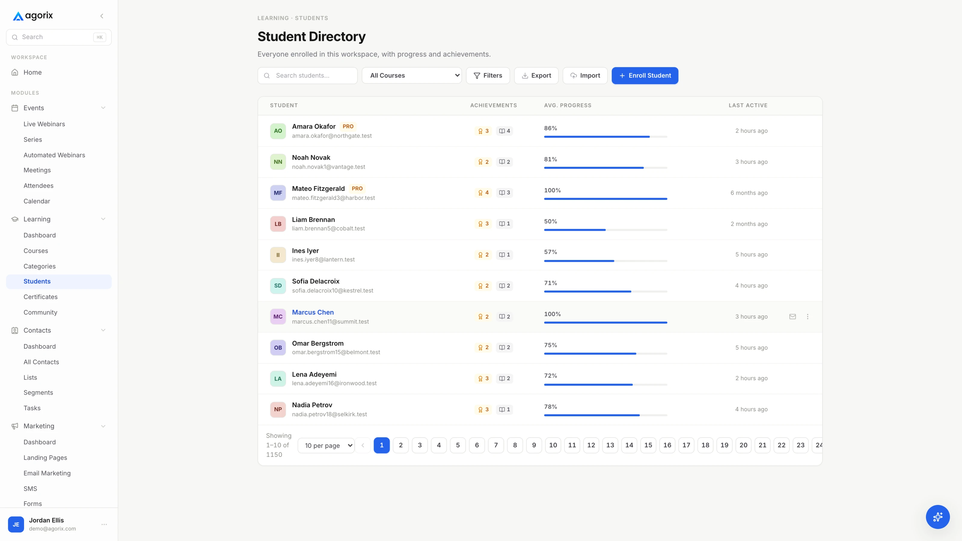
Agorix keeps video, text, downloads and resources inside the same lesson and one student portal, with each student’s progress on the shared customer record — so the transcript is where they already are, and the lesson people stop at is visible — see how courses work.
Everything above is craft: things that make a course better for identifiable people, all of which you can do this week. There is also a standards-and-obligations layer, and it deserves an honest paragraph rather than either silence or scaremongering.
The standard almost everything points at is WCAG — the Web Content Accessibility Guidelines. It is organised into levels, and AA is the one policies and contracts usually name. Much of the practical list above lines up with common AA criteria: captions for pre-recorded video, minimum contrast ratios, not conveying information by colour alone, keyboard operability, and text alternatives for images. Working down this page is therefore not a detour from the formal version; it is most of the uncontroversial part of it.
Whether you are formally obliged to meet a standard is a different question, and it depends on things this page cannot know: where you operate, where your students are, whether you sell to public bodies, universities, employers or government programmes, whether your course is used in an educational or employment setting, and what you have already signed. Those obligations are real and specific, and the honest answer is that it is a question for somebody qualified — an accessibility specialist or a lawyer working in your jurisdiction — rather than something to infer from a guide written by a software company.
When a client, an institution or a procurement form asks for accessibility, get the specifics in writing before you agree: which standard, which version, which level, what evidence they expect, and who signs off that it has been met. And do not publish a conformance statement you have not had reviewed — a claim about your product is a claim you can be held to, which is exactly the situation where the cheap version of this work stops being enough.
None of which is a reason to wait. The practical list is worth doing whether or not anything obliges you, it is what students notice, and it turns any later formal review from a rebuild into a review.
That the course works for people who cannot rely on one channel: students who cannot hear the audio, cannot see the screen clearly, cannot use a mouse comfortably, or cannot process a wall of unstructured material. The everyday version is the six areas on this page — corrected captions, a transcript per lesson, legible slides and recordings, one idea per lesson, alt text on meaningful images, and materials made of real text. None of it needs a specialist, and all of it is cheaper per lesson than as a retro-fit project.
They are a good draft and a poor final. Automatic captions handle ordinary speech well and reliably mishear the words a course depends on: names, product and feature names, jargon, acronyms, numbers, units and settings, plus speaker changes in anything recorded with more than one person. Read the file against the audio once, correct those categories, and keep a term list so that lesson two onwards takes half the time.
They do different jobs. Captions are timed to the video and serve somebody watching it. A transcript is a document — it can be searched, skimmed before watching, copied from, translated, and read by somebody who would rather read than watch. It is also the only text version of the lesson, which makes it the raw material for notes and summaries. Produce it from the corrected captions and one pass of work gives you both.
WCAG is the standard most policies, contracts and regulations point at, and AA is the level usually named. Whether it formally applies to you depends on where you and your students are, who you sell to — public bodies, universities, employers and governments often specify it — and what you have signed. That is a question for somebody qualified in your jurisdiction rather than something to infer from a guide like this one. The practical list above is worth doing either way, and it makes any later review a much smaller job.
Correct the captions on the lesson most students actually reach, and publish a transcript beside it. One pass covers the largest group of people it can help and produces a searchable, skimmable asset for everybody else. The next cheapest change costs nothing at all: narrate what you are doing on screen rather than saying “here” and “this”, starting with the next lesson you record.
Describe what the image means in context rather than what it looks like. If a screenshot exists to show a toggle switched on, that is the alt text. If a chart exists to show a trend, give the finding rather than the axes. Decorative images take empty alt text so screen readers skip them. Skip “image of”, keep it to a sentence, and put any longer explanation in the body text where every student gets it.
Lessons, transcripts, downloads and resources in one student portal, enrolment and checkout on the same customer record, and progress the rest of the business can read — so the work you put into a lesson reaches the student who needed it — built for course creators.
14 days · $0 due today · Payment method required · Cancel before first charge and pay nothing